
Friday, 24 November 2017
Double/ expanding effect
Thursday, 23 November 2017
Coloured Overlay
 In order to add a colour to the video, as well as fit the genre conventions of heavy editing , I found stock footage that is copyright free online, specifically for overlaying on top of shots. To begin with, I just lowered the opacity of the overlay and layered it on top of the shots. however, there is one section of the overlay which flashes white which did not fit with the colourful aesthetic I am trying to achieve. therefore I cut the over lay up and deleted the white shots. Also the speed of the overlay originally is very quick and doesn't fit to the beat. therefore I slowed the clip down to 20% to make the overlay more discrete on top of the clips.
Monday, 20 November 2017
Performance in Sequence
This is the collection of the performance clips, sequenced and synced to the track. The clips towards the start of the video have began the editing process.
Saturday, 18 November 2017
Artist Social Media Pages

 Social media is evidently important on existing artist web pages. They have continuously running accounts to connect with fans as well as promote themselves and release their latest art work. From this, I have created both a twitter and Instagram page for the artist as from research, they are the two most popular social media platforms disregarding snap chat (as it is difficult for a new artist to promote on snap chat as it is a close audience of fans). Both the pages feature recent photos from photo shoots related to the theme of the album ahead of the 'release'. The social media platforms require constant attention which is why I have used the social media manager Zoho which archives social media post and schedules their release ahead of time. This meant that all the posts will be released to the artists fans every day, constantly promoting the King Pink Music brand.

Friday, 17 November 2017
Fist digipak draft feedback:
Feedback found that audiences responded well to the front cover, yet were less responsive to the inside panels as they stated that they were not a visually interesting and the product as a whole piece didn't give much information about the tracks of the artist. Therefore to improve this editing the lyrics of the tracks into the design could be an idea.
Thursday, 16 November 2017


Tuesday, 14 November 2017
Beginning of the edit

 The shots from the performance shoot have been organised into the correct sections of the song and lip synced with the track. As the editing process continues, the best performance for each section will be selected and layered in a fast cutting style in order to mimic performance styles from other performers in the disco genre.
 Saturday, 11 November 2017
Making of the sides of the digipak

 The majority of the sides of the digipak consist of the photos from the photoshoot. The picture on the right was the original photograph from the shoot, however when placed onto the black background the pink contrasted the black background too much to crate a variety of visual appeals across the panels. I used photoshop to edit the contrast and brightness levels of the picture as well as placing a blue overlay of colour onto the picture to give it the colder effect for the digipak panel.
 The picture was then inserted onto the correct size panel and the King Pink Crown graphic created previously along with the neon ovals was inserted to finish the panels design.
 The CD panel was created in a similar was with the picture and graphics placed into the frame. the CD was the invested to create the design for the actual CD as well as the DigiPak backdrop.
 |
| With the graphics added in photoshop after the picture editing. |
 |
| The other panel designs created in the same way. |
 |
| Panels neon graphics added over the top of the original photo shoot image. |
 The credits and information panel was design taking template ideas from existing digipak designs, all the information follows the copyright and credits followed on a large majority of existing digipak products.
Thursday, 9 November 2017
Video diaries from performance shoot :
A collection of shots taken from the performance photoshoot. The shots show the set up of the lights used and how the portable lights were moved in conjunction with the movement of the camera.
Wednesday, 8 November 2017
Creating the back of the digipak

The back of the digipak consists of copyright information of which I drafted off of several existing digipaks from the disco genre. In order to keep the accuracy and professionalism of the EP cover I also included both the copyright symbol and bar code, which were originally inserted in black with a white rim but were inverted to become white images to improve the general aesthetic of the back of the digipak. The typeface for the song titles matches the title of the albums typeface and was created in the same fashion, duplicating the layers with a Gaussian blur to create the neon glow effect.

The oval design was a direct replica from the front of the digipak design with the contrast levels turned up to 100% with the opacity level also high.
Sunday, 5 November 2017
New digipak due to copyright images

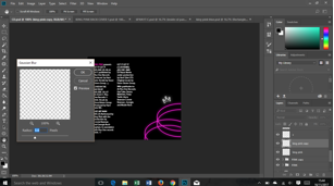
 The digipak design previously designed used an image from google images that was copyright protected, therefore a new digipak design must be created that does not feature any copyrighted or plagiarized images. In keeping with the tunnel focus idea I have drawn several ovals onto the digipak background, duplicated the layers and put a Gaussian blur effect over the duplicated layer to create the neon glow to the ovals. Multiple ovals were then placed vertically and horizontally to create the spiral tunnel effect. diffeent neon shades of blue and pink were also added to create a significantly noticeable colour scheme to the EP artwork.
 The previously designed graphic of the title and artist name were then positioned in the center of the digipak ready for the images from the photoshoot to be inserted onto the front artwork.
 The image taken from the photoshoot were taken into photoshop where I edited the background and lighting effects to fit with the neon, blue and pink colour scheme, although the editing was kept minimal thanks to the consideration of colour lighting during the photo shoot. the images contrast and levels of sharpness were brought up, this removed the blue background and make a clearer picture. basic touch ups were made on the face and hands so that the image appears flaw free.
Saturday, 4 November 2017
Smoke to digipak
 As the smoke effect has been created for the digipak background, the next stage was to develop the backdrop to have a more exciting visual impact for the customer of the EP. The tunnel image (taking inspiration for previous mock up and experiments with the digipak design) was taken and placed as an overlay through the smoke
 effect to leave behind the distorted colour smoke effect. The previously created graphics for the title of the EP and the artists name were inserted onto of the created image to create the backdrop for the EP before the photo/photos from the shoot are inserted in the center. The levels of the smoke and image layer were risen to bring the neon aspect to the background that is essential for fitting with the disco genre of the track and the neon colour scheme conventions to accompany the genre.
Thursday, 2 November 2017
Smoke background for the digipak
 My main idea for the digipak artwork is to create a neon smoked effect with the artist featuring in the center. The first step to creating the cover artwork was to create the smoke effect. In photoshop, I drew up a grey squiggle in various thicknesses in a grey colour. Then the dodge and burn tools were used on various spots across the squiggle leaving behind the light and dark dotty effect.
 The Gaussian blur layer effect was then put over the squiggle layer to create the smoke effect. As the digipak colour scheme has to reflect the genre of the track (disco) The smoke effect was then changed to neon blue and spread as a backdrop across the width of the digipak to create a background for the photo shoot pictures to be edited and layered on top of.
Subscribe to:
Posts (Atom)