 I created a selection of name logos for the artist in order to establish a recognisable logo for the audience to associate the music and artist to. The most popular original drawn logo designs were then taken onto photoshop and developed from there. The first design created was glittery with a more cartoonish typeface. However this design didn't create the lasting impression that I was intending, and also didn'
t fit with the genre.
A selection of other logos were created, in order to get a development to the final design as well as a sort of logo mind map of the different ideas.


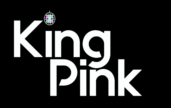


The final logo design decided is a simple san serif font with a crown above one I and a simple dot above the other I. Of all the designs this was the most recognisable from a significant distance which is the most important element to a named logo.

No comments:
Post a Comment